
Ad Layout Optimization That Protects Revenue
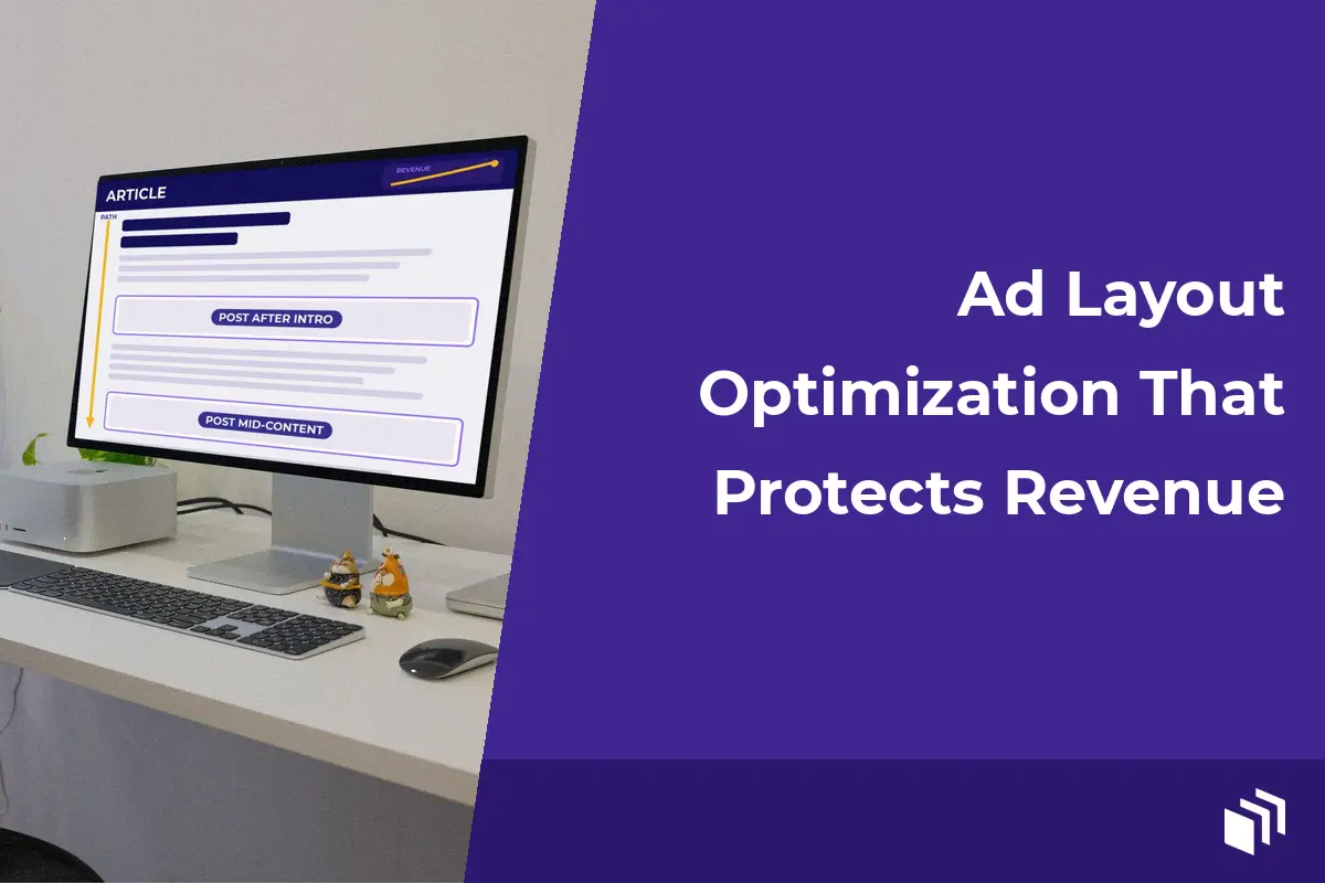
A 300×250 ad placed halfway through a useful article can earn more than a larger unit pushed above the fold. I’ve seen that play out more times than I can count, and it’s the practical reality behind ad layout optimization. Filling every open space with advertising was never the goal. The goal is giving your valuable placements enough visibility to perform while you protect the reading experience that brought visitors to your site in the first place.
For WordPress publishers, that balance matters twice. A cluttered page can drag down engagement and hurt Core Web Vitals. It can also make direct sponsors a bit reluctant to come back. But a layout that’s too cautious can leave sellable inventory sitting unused. So I like to start with how people actually move through your content, then use reporting to improve one important decision at a time.
What Ad Layout Optimization Should Improve
A strong layout serves readers and advertisers at the same time. Readers need a clear path through the content and readable typography. They also need pages that don’t jump around as ads load. Advertisers need placements that actually get seen and that are relevant to the page, in a context that supports their message.
So impressions alone aren’t the finish line. An ad can rack up plenty of served impressions in a low-visibility sidebar and still produce weak results. I’d look at click-through rate, viewability where your reporting supports it, revenue per thousand impressions, session depth, and page performance together. A placement with a modest click-through rate might still be a winner if it’s consistently visible and valuable to a direct sponsor.
There’s no universal “best” ad layout. A recipe publisher with long, image-heavy posts has different opportunities than a business blog with short tutorials. A local news site with frequent page views is different again. Your traffic mix changes the answer too. Returning desktop readers may be just fine with a stable sidebar placement, while mobile visitors might respond better to an in-content unit after they’ve engaged with the opening section.
Start With the Reader’s Path
Before adding or moving ads, I’d review your most visited templates. That means single posts and category archives, plus search results, landing pages, and any high-traffic custom post types. Don’t assume an ad position that works on a blog post will work on an archive page. People tend to scan archives quickly, while long-form posts create natural pauses where an ad can show up without interrupting the reader.
Start by asking where attention is earned. On an article page, the opening decides whether the visitor sticks around. An ad placed before the first useful paragraph competes with that moment. In a lot of cases, putting the first in-content unit after the introduction (or after the first substantial section) gives readers a reason to keep going before you present an offer.
Then think about the page’s natural breaks. A sponsored placement between major sections can feel intentional. An ad wedged between a heading and the paragraph it introduces? That just feels like friction. Keep headings connected to their content and avoid splitting short lists or tightly related instructions. And leave enough space around the creative that the page doesn’t feel crowded.
On desktop, a sidebar can be worth it when it stays aligned with the content and doesn’t leave awkward empty space below it. Sticky sidebar ads can increase exposure, but they need restraint. If a sticky unit takes over a narrow viewport or overlaps important site controls, the revenue gain may not be worth the frustration.
Prioritize Mobile Before Desktop
Most publishers can’t treat mobile as a scaled-down desktop layout. Mobile visitors have less screen space and different scrolling habits. They also have a lot less patience for intrusive formats. An ad that looks reasonable beside a 1,200-pixel-wide article can take over the entire experience on a phone.
Use responsive ad sizes and reserve space for them before the creative loads. That cuts down on cumulative layout shift, which keeps text from jumping around while people read. Fixed dimensions are often the simplest option for known placements. If an ad network returns multiple possible sizes, use a container strategy that fits the expected creative without leaving a big, permanent blank area when no ad gets served.
Pay close attention to the first screenful of content. A mobile visitor should be able to identify the article, see useful copy, and start reading without scrolling past a stack of ads. That’s just good usability. It also gives your content a better shot at earning the engagement that supports later ad impressions.
And test your layout on real devices, not only browser resizing tools. A sticky footer unit may be technically responsive and still cover a newsletter prompt, cookie notice, or navigation element on one specific phone size. Small conflicts like these are easy to miss… and expensive in reader trust.
Build a Placement System, Not a Collection of Shortcodes
Manual ad code works fine for an occasional campaign. It gets hard to manage, though, once you’re scheduling sponsors and rotating creative across several templates. A placement system gives every location a clear purpose and makes changes a lot safer.
I like naming placements by function and location, like “post after intro,” “post mid-content,” “desktop sidebar top,” or “category banner.” Skip vague labels like “ad 1” and “slot B.” Clear names help your team and your clients understand what’s being measured and where a campaign will appear. Your future self will thank you too.
For a typical content site, define a limited set of reusable placements, then control which ads can run in each one. That protects the layout from one-off code changes, and it lets you schedule campaigns without editing published posts. It’s especially handy for agencies managing similar placements across multiple client sites.
AdSanity can support this WordPress-native workflow by letting publishers create, schedule, rotate, and track ads while keeping placement controls close to their existing content tools. That makes it easier to manage local sponsors alongside third-party network creative, so every campaign doesn’t turn into a development task.
Match Ad Density to Content Depth
Ad density is where a lot of otherwise sensible layouts go wrong. A 3,000-word tutorial can support more in-content opportunities than a 450-word announcement, because it gives readers more depth and more natural pauses. Apply the same ad count to both and you end up with underused inventory on one page or a crowded experience on the other.
I think content length works best as a guardrail. It shouldn’t be a rigid formula. A detailed guide with screenshots, tables, and product recommendations may need fewer ads than its word count suggests, since those visual elements already break up the page. A text-heavy opinion piece might fit a well-spaced unit more naturally.
Think about the intent behind the page as well. A high-intent comparison page can support relevant sponsor placements. An instructional support article may need a quieter layout, because visitors are trying to solve a problem quickly. If ads get in the way of finishing the task, you can lose repeat traffic and the long-term value that comes with it.
For direct-sold campaigns, scarcity can work in your favor. A sponsor may value one prominent, well-defined placement more than a sitewide rotation with too many competing impressions. Fewer placements also make reporting clearer when you need to show a sponsor what their investment produced.
Test One Variable at a Time
I think layout changes should be treated as experiments. Redesigning on a hunch rarely ends well. Pick one placement with enough traffic and define the metric you want to improve. Then run a controlled change long enough to account for normal swings in traffic.
Say you move an in-content unit from directly below the title to after the second paragraph. Compare revenue, click-through rate, scroll depth, bounce behavior, and page speed before you decide which version wins. If revenue goes up but engagement drops sharply, that’s not a simple win. The right call depends on what the page is for. Maybe that’s ad monetization, maybe it’s lead generation or subscription growth, or maybe it’s a mix of all of them.
Keep a simple record of what changed, when it changed, and why. That stops teams from repeating failed tests, and it gives agencies a useful history when clients ask why a placement exists. It also keeps seasonal traffic changes from being mistaken for layout performance.
Protect Speed and Stability
An ad layout is only as good as the page that delivers it. Too many third-party scripts can slow rendering. Heavy creative and unreserved containers do the same, and they cause visible shifts too. All of that hurts the experience before visitors have even had a chance to see your best content.
Pick ad tools that let you add capabilities when you need them, instead of loading every possible feature on every page. Keep an eye on the number of ad calls and avoid duplicate tags. I’d also review whether low-performing placements are worth their technical cost. If a unit adds little revenue while making pages slower, removing it can improve the performance of everything else.
Good ad layout optimization comes down to a simple principle. Your content is the product, and advertising should support the business behind it. Give every placement a job. Measure whether it does that job. Then keep making the next sensible improvement.

Written by
Ready to get started?
Time to take control of your ads.
Find your perfect plan and go for it.
Popular Pro Add-Ons



Our Community
Join our mailing list to keep up to date on everything happening with AdSanity and Pixel Jar.
Note: Your email address will be added to our CRM and be used to receive emails from Pixel Jar. You can unsubscribe at any time.
Our Partners

Ready to Make Money With Your Site?
Get ads on your site in
60 minutes or less
with AdSanity.
With our 14-day money back guarantee, it’s easy to see if AdSanity is the right fit for you.

