
Why Ads Underperform on WordPress Publisher Sites
Picture a leaderboard that pulls thousands of impressions a month and barely earns anything. Or a sponsored placement that looks great, loads fine, and lands in front of the right readers… and the advertiser still walks away disappointed. I’ve watched publishers stare at numbers like that and start ripping out ad units. But figuring out why ads underperform starts with something simpler. An ad unit isn’t a campaign strategy.
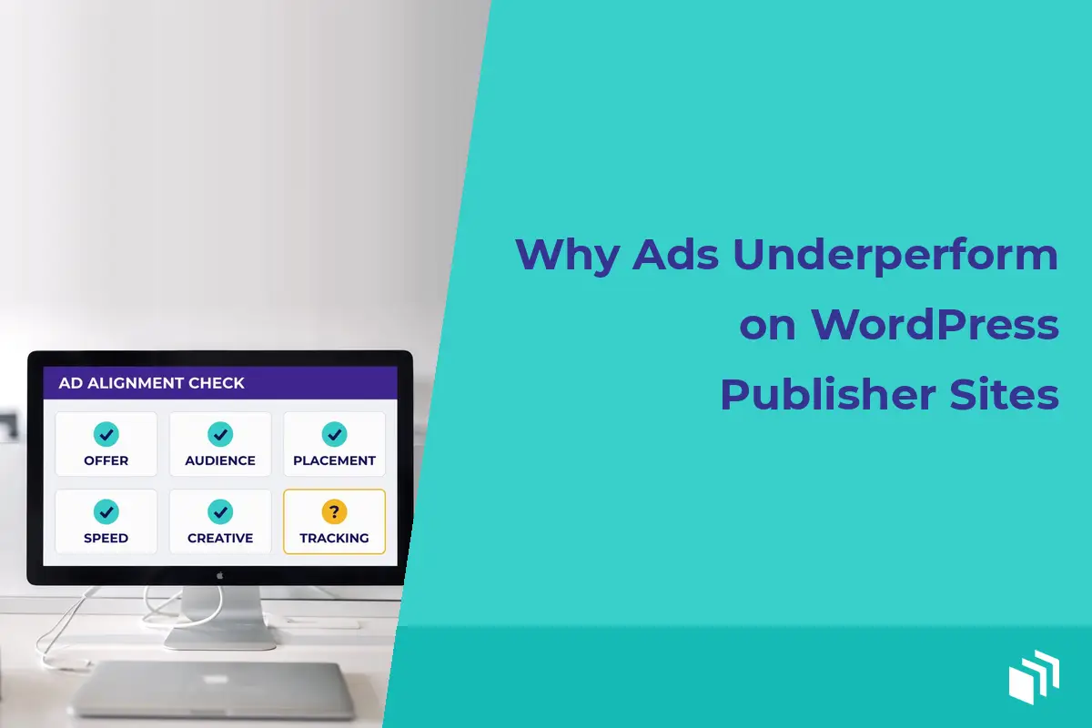
On a WordPress publisher site, it’s rarely one broken setting. Usually performance slips because the offer, the audience, the placement, the page experience, and the measurement don’t line up. The good news? You control every one of those. And you don’t have to turn your site into a complicated ad-serving operation to figure out which one is the problem.
Why Ads Underperform: Start With the Actual Goal
Before you touch the creative or move a placement, decide what “underperform” actually means for this campaign. Click-through rate is useful, but it isn’t the only number that matters.
A direct-sold sponsor might care about qualified leads. An affiliate promotion needs sales. A display network placement probably gets judged on revenue per thousand impressions. And a house ad might exist to grow your email list or promote one of your own products.
When you treat every campaign like a click-through-rate problem, you make bad calls. A really visible ad can rack up clicks from curious visitors who never convert. Meanwhile a lower-clicking placement inside a tightly focused article might bring in better leads, because that reader is closer to making a decision.
So I like to pick one primary outcome and a few supporting metrics. Say a campaign is selling a WordPress service. Completed contact forms could be the main number, and then impressions, clicks, click-through rate, and landing page engagement help you see the path to that result. It gets a lot easier to spot where things actually break down.
Your Audience May Not Match the Offer
Traffic volume and buying intent are two different things. A broad how-to article can pull a big audience from search, but plenty of those readers just want a quick answer. Show them a premium product ad at that moment and you’ll collect impressions with very little response.
Look at what the page is about, not only how many people visit it. Someone reading “how to start a blog” needs something different than someone comparing managed hosting plans. That second reader is way more likely to respond to a relevant hosting offer, even if the page gets less traffic.
That’s why I think page-level targeting usually beats sitewide placement. When the campaign justifies it, separate your ads by content category, audience segment, or where the reader is in their decision. A sitewide sponsorship still has value for awareness (just judge it as awareness, not as a bottom-of-funnel conversion campaign).
Timing matters too. A tax software ad can struggle in July and do great in March. An ecommerce offer might convert during the holidays and fall flat the rest of the year. Before you call a campaign a failure, check whether the season and the audience’s demand even support the offer.
Placement Is More Than Picking a Sidebar
Where an ad sits changes how often it’s seen, how much attention it gets, and how the page feels to read. An ad parked below a long article may technically log an impression, but a lot of visitors never scroll that far. Push one above the headline and it’s visible, sure, but it can feel pushy and drive people away.
The best placement depends on the page and the campaign. In-content placements tend to work when they show up at a natural pause, right after the reader got something useful. Sidebar placements give steady exposure on sites with a lot of desktop traffic. Sticky units can boost visibility, but they need careful size and frequency limits (especially on mobile).
Don’t assume the most prominent slot is always the most valuable one. Show advertisers exactly which placement they’re buying, then measure each one on its own. If a top-of-post unit, a mid-content unit, and a sidebar unit do different jobs, they shouldn’t be lumped into one report.
Watch for ad blindness, too. Regular visitors learn to tune out anything that looks like a standard banner, especially when every page uses the same layout. Try a different size, a more relevant creative format, or a placement that’s a little less predictable but still friendly to the reader. I’m not talking about tricking anyone. You just want a useful offer sitting somewhere it has a fair shot at being noticed.
Slow Pages Can Make Good Campaigns Look Bad
If an ad loads after the visitor already scrolled past it, the campaign lost its chance before anyone saw the creative. Heavy third-party scripts and oversized image files slow a WordPress site down. So do unoptimized HTML5 units and piling on too many ad calls.
Speed is a revenue problem and a reader problem at the same time. People are less likely to wait for a page, read your content, or trust a site that jumps around while ads load. Layout shift drives me nuts on mobile, where a late banner shoves the text you were halfway through reading.
Use creative that’s sized correctly and reserve space for ad dimensions you already know. Keep third-party code limited to what each campaign really needs. If you’re running a few networks alongside your direct-sold ads, ask whether every one of those scripts earns its spot. More demand sources can mean more revenue, but only until the extra code starts hurting speed, visibility, or usability.
A lightweight setup that lives inside WordPress helps a lot here. You can manage local ads and external creative without hand-pasting inconsistent code into posts and templates. That’s what we built AdSanity to do… give publishers placement and scheduling controls while the whole advertising workflow stays inside WordPress.
Creative Often Fails the Clarity Test
A visitor should get the offer in a second or two. When an ad tries to cram in five product features, a fuzzy brand message, and a couple of calls to action, it usually says nothing clearly.
Good creative makes a specific promise to a specific reader. It has a headline you can read, a call to action you can see, and a landing page that picks up the same message. If the banner says “Save time on client reporting” and the landing page opens with a generic corporate statement, the visitor has to work way too hard to connect the dots.
Creative fatigue is the other one I see all the time. Show the same ad over and over to a returning audience and it slowly loses its ability to grab attention. Rotate in fresh versions while keeping the core offer steady enough to measure. And change one thing at a time, like the headline or the image or the audience segment. If you change everything at once, you won’t know what caused the result.
Bad Tracking Creates Bad Decisions
When reporting is incomplete, a campaign can look worse than it is (or better). Click tracking tells you people interacted with an ad. It doesn’t automatically tell you whether they bought something, filled out a form, or subscribed after they left your site.
Make sure your impression counts, click counts, and conversion tracking all use the same definitions. Check that testing traffic, internal clicks, and bot activity aren’t skewing the numbers. If an advertiser sends people to a third-party landing page, agree on how conversions get reported before the campaign starts.
For direct sales, give clear reporting periods and separate ad rotation, scheduled dates, and actual delivery. If three advertisers share one placement, each of them needs an easy way to see how many impressions and clicks their campaign got. Native tracking makes that simpler, but a human still needs to look at the reports. A sudden spike in clicks could be a winning creative. It could also be an accidental tap pattern on mobile or a technical glitch.
Test With Enough Data to Learn Something
Swapping an ad every day feels productive, but it usually kills any useful analysis. Smaller sites may need weeks (not days) to collect enough impressions for a fair comparison. Big publishers can test faster, but even they shouldn’t crown a winner off a tiny slice of traffic.
Start with a clear hypothesis. Maybe a mid-content placement will earn more qualified clicks than the sidebar. Maybe a text-forward creative beats an image-heavy one for readers of technical tutorials. Run the test long enough to cover normal swings in traffic, then compare the results against the campaign’s primary goal.
Some tests will show you a trade-off. A sticky unit might get more clicks and also more reader complaints. A bigger creative might earn more and push your content further down the page. I don’t count those as failures. They’re decisions about the kind of publishing experience and revenue model you want to run.
In my experience, the best ad program isn’t the one with the most scripts, placements, or dashboard reports. It’s the one where every campaign has a sensible audience, a clear purpose, a reliable place to show up, and numbers you can trust. Start by fixing whichever mismatch is easiest to verify. Then make your next change with evidence instead of guesswork.

Written by
Ready to get started?
Time to take control of your ads.
Find your perfect plan and go for it.
Popular Pro Add-Ons



Our Community
Join our mailing list to keep up to date on everything happening with AdSanity and Pixel Jar.
Note: Your email address will be added to our CRM and be used to receive emails from Pixel Jar. You can unsubscribe at any time.
Our Partners

Ready to Make Money With Your Site?
Get ads on your site in
60 minutes or less
with AdSanity.
With our 14-day money back guarantee, it’s easy to see if AdSanity is the right fit for you.

