Mobile-Optimized Ads

Every business needs a carefully designed website that enables effortless navigation and a performance-optimized user experience. Your website is arguably the hardest working member of your business toiling around the clock to generate new leads. This isn’t particularly new information. However, what is still regularly overlooked is the importance of mobile-optimized sites.
That isn’t to say that businesses are not considering them—especially as most CMS platforms will create one by default—but they tend to be neglected or are merely an afterthought. Almost to the point where digging out the desktop computer or laptop becomes a preferred experience over accessing a website conveniently from the device that is always in our pocket.
So what effect does a lack of mobile optimization have on website advertising? Quite a profound one and we are going to explain why.
But first…
Why is Mobile-Optimization Important?
Before you think that you don’t need to optimize your mobile website, let’s consider one alarming statistic.
Almost 59% of global website traffic is from mobile devices!
And that is merely the tip of the iceberg. Inevitably as mobile use continues to grow, so is mobile ad spending. Based on the trajectory of mobile ad spending in relation to desktop, Statistica has predicted that mobile ad spending would surpass desktop by 2022 although the final report is yet to be released.
This is a glaring indicator that now is the time to begin investing in mobile-optimized ads, but it isn’t quite as simple as merely using the same ads that you are currently using for your desktop website.
What Makes Mobile Ads Different?
Placing ads on a mobile website involves more careful consideration due to the reduced screen size. This in turn affects how users will interact with them, their legibility, and how they sit alongside content.
Each of these factors not only determines the dimensions of the ad but also the amount of content included within each advertisement.
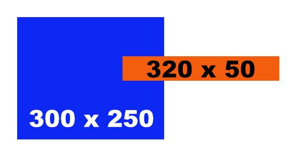
Using the IAB standards as a reference, a standard desktop ad banner is either 300 x 250 or 300 x 600 pixels in size, the prior considered a “standard” sized ad for digital use. By comparison, the standard size for a mobile ad is a mere 320 x 50 pixels, or 300 x 50 for smaller mobile devices.
You might be wondering why this standard size is so small compared to your phone’s display resolution – usually a minimum of 800 pixels wide for smaller devices. This is because web developers use viewports to create mobile-friendly pages, and these are considerably smaller in dimensions.
For example, an iPhone XS has a resolution of 1125 x 2436 pixels, but a viewport size of only 375 x 812.
Mobile-optimized landing pages
Another crucial carryover from desktop sites, mobile landing pages play an equally important role in the mobile browsing experience. If you are hosting ads then don’t forget to create a landing page to link them to.
Much like mobile ads in general, the space you have to work with is smaller so the copy needs to be concise. It is likely your visitors will skim the page so distill the page information down to the essentials.
The design needs to be simple and all content—especially the CTA— above the fold. If a user has to scroll on a landing page, it’s likely they won’t.
Mobile Advertising Best Practices
While mobile devices have now surpassed desktops in percentage share of global web traffic, it is important to remember that people engage with mobile differently. Bounce rates on mobile are generally higher than on desktop devices meaning that the window of opportunity for capturing a mobile user’s attention is even smaller.
The solution is to use ads that are compelling, relevant, and that load instantly.
A mobile-optimized headline needs to deliver a lot in a tiny amount of space and time. You can use keywords so that users know immediately that the product is what they are looking for. While you may have a call to action, chances are that the headline will be the most clickable part of your ad.
But don’t disregard the CTA entirely, just keep it to the point. Users still must know what the process involves.
Finally, the description text needs to focus on your business’s unique selling proposition and why it is the solution customers are looking for.
The limited space of mobile ads may seem like a hindrance, but it can actually prove to be an opportunity for testing what engages best with your audience.
For example, by creating different versions that focus on a specific feature of one product, you can understand what visitors are looking for the most which can help influence other website content.
AdSanity subscribers can use the Rotating Ad widget to test 2-4 variations of a mobile ad and generate reliable data using Google Analytics tracking integration.
Optimize Your Mobile Ads with AdSanity
With our parent company’s (Pixel Jar) extensive experience working in website development, we know a thing or two about how to build websites as well as optimize your advertising on them.
Because AdSanity takes styling cues from the WordPress theme that your site uses, if your theme is not optimized for mobile, then neither are the ads.
In an ideal world, we can combine the impressions and tracking data from all of your advertisements together and across all devices. However, there is no reason why you cannot benefit from analyzing the data for how advertising content performs specifically on each device.
Think of it like A/B testing across devices.
You will be able to analyze how the same content is performing on desktop compared with mobile. These results will offer crucial insight into how your customers and site visitors are interacting with your website across different devices.
AdSanity supports Beaver Builder, Elementor, and Divi with custom modules for each platform. We have created specific modules for each builder that will adjust depending on the screen size of the device viewing your mobile site.
If we were pushed to make a recommendation of how to get the most out of AdSanity for your mobile site, we would suggest using Beaver Builder with the Astra theme. We have found this to be the builder/theme combination that communicates the best with each other.
It’s Time to Embrace Mobile Websites
As global website use continues to lean more towards mobile devices, now is the time to get ahead and start investing at least equally in mobile optimization and advertising.
If you are an AdSanity subscriber and need help optimizing your site ads for mobile, you can reach out to Pixel Jar for assistance.
Pronto para começar?
Time to take control of your ads.
Find your perfect plan and go for it.
Ready to Make Money With Your Site?
Get ads on your site in
60 minutes or less
with AdSanity.
With our 14-day money back guarantee, it’s easy to see if AdSanity is the right fit for you.
Tags


Our Community
Join our mailing list to keep up to date on everything happening with AdSanity and Pixel Jar.
Note: Your email address will be added to our CRM and be used to receive emails from Pixel Jar. You can unsubscribe at any time.
Our Partners

